Creating a welcoming place for those living with cancer
September 10, 2023
Over Threefold ROI for Rainbow International Restoration of Westchester
March 24, 2024
 

Key capabilities:

  • Brand strategy platform (vision, purpose, promise, values, voice)
  • Competitive analysis
  • Executive off-site facilitation
  • Naming
  • Strategic business planning
  • Values-driven culture development strategy
  • Logo and wordmark design
  • Visual Identity


Challenge

TrueDigital was known as an institutional platform for global digital finance. Still, there was more to the story, and the generic name with its legacy roots was holding back the company. Against this backdrop, the company is led by an unrivaled team of experts who have lived through the transformation from disruption to normalized markets. The company was in the process of building the next generation digital asset ecosystem that reduces risk and provides capital optimization. The company knew it had something massive in the works. It needed a big vision. Create was challenged with creating a new name and assisting the CEO with his vision for the identity that brought the name to life.

The right name would be easy to say, stand out in a field of competitors, engender trust, speak of the offer, and give the company room to grow. The name also had to express maturity and specifically appeal to global money center banks, as well as proprietary trading firms, cryptocurrency miners, lenders, hedge fund managers, endowments, sovereign wealth and pension funds, and ultimately to retail customers.


Solution

Following a structured analysis of the business, the long-term goal of the company came into focus: be part of every digital transaction, the understood leader in the space.

In addition to resonating with the myriad audiences, the name needs to projecting a consultative, confident, and insight-laden brand voice. After three rounds of naming that generated over 250 names, the company landed on Tassat. Sounding like ‘tacit,’ the coined name speaks of quiet understatement. Tassat was one of a handful of palindromes presented. The use of a palindrome—the word reads the same forwards and backwards—accentuates a common element in each of the company’s lines of business: the two-way nature of equity trading. The name has been cleared for use in all of the company’s business applications worldwide and was activated in September 2019.

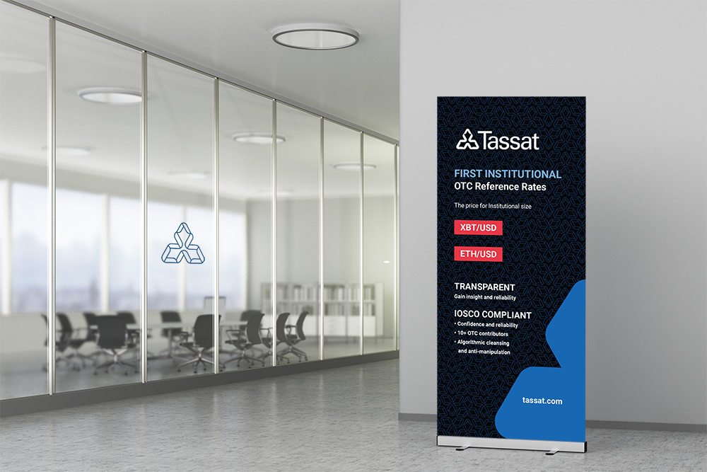
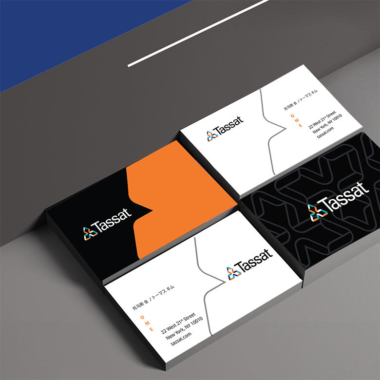
The wordmark uses Zurich, a font with letterforms that are bold, smooth, simple, and understated typeface that also helps accentuate the palindromic nature of the coined word. The bracketing t-forms create a rectilinear container for the curvier letters between them. The tri-form icon was presented in several color combinations and is designed to communicate organic and triangular strength. It is also immediately recognizable and will eventually come to be synonymous with the name of the company.


Results

Tassat has a new vision supported by one-, three-, seven- and fifteen-year tactical goals. Tassat also has a new brand strategy and corporate name that help it tell a compelling, future-focused story to the world.

SEE SOME RECENT PROJECTS FROM CREATE