Solution
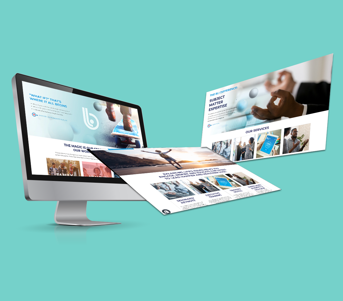
The first thing we did was elevate BLI from unofficial shorthand for the company name to how the logo is read. Using the lowercase B as a wrapper for the L and the dot of the I (as a simplified stand-in for the letter), we also created a dynamic logo with an economical form that mirrors the shorthand name. The dot on the I also evolved into a motif that expresses individuality, whimsey, inspiration, and possibility. With the motif layered into photographs of people feeling free in the potential of their own lives, BLI now presents a plain, confident, empowering, and visually narrative identity that supports the big idea: that life is different now.